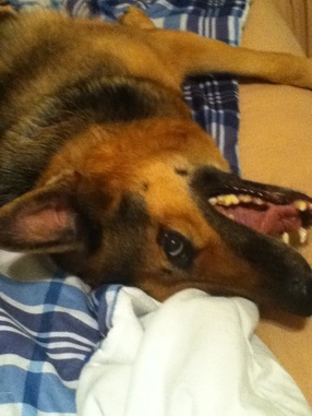
To start off my pet portrait I found a picture of my dog that I really liked, which wasn't too hard because every time she saw the camera she got really excited. 
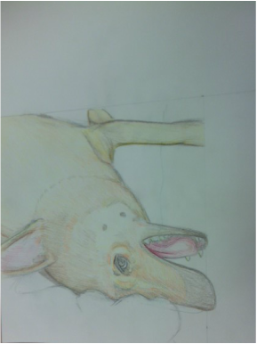
To get started I measured out how big the picture was and amplified it by 1.5 x and sketched the outline onto a piece of paper I measured. I made sure to get the proportions and placement right at this point of the process otherwise everything from here on would be wrong. Next I started with the lightest color I saw and layered that down that way the light colors would show through sand I could gradually go darker without being afraid I went too dark and couldn't come back. I did this with many many colors being sure my strokes all started from the same direction, but had some movement in where they ended up depending on where it was. I also made sure to make the hair size about the same, but kept it interesting with varied hair sizes. 
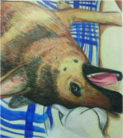
Lastly I darkened the colors until they resembled the photo and I worked on the background until I had gotten the colors and shading right. I made sure to keep the light areas soft in color and darker up the colors that needed to be in the dark. I'm proud of this picture because I spent a lot of time trying to get the fur colors just right and I made to sure to detail the eye and ears because those are important features to get right. If I could change anything I'd be the way I draw the lines and their color because it's not as bold and each line blends in so I would need to make them stand out a bit more, but other than that I'm glad I chose to work with colored pencils.
0 Comments
For this project I was trying to decide on which concentration I should use. I was unsure If I wanted to draw my friends and their reactions to their favorite music or create my own story with characters I designed. To help me decided I decided to do one of each and this is the music project I came up with. I wanted to create a piece with soft, but bold colors and try to capture the feeling of joy with my medium. After trying colored pencils and a few other mediums I finally settled on this one. I was concerned about starting a project in oil pastels because I tend to lean my hand on the paper a lot and I was constantly afraid I would ruin my piece if I forgot about it., but I really wanted it to be vibrant and decided it was worth the risk. I have little experience in oil pastels but every time I added colors or shapes I tried to picture the next step completed and that helped me keep me on the right track.
I'm really happy at how this piece turned out because I figured out a way to add depths without coloring an object in its natural coloring and I was able to use oil pastels in a way that enhanced the piece further by giving it more emotion. I'm always intrigued by music and they way it makes people feel and how they express i, so doing a project like this helps me better understand my friends and lets me as an artist learn how to show emotion even if it's only a slight hint of something. For this project we had to choose a location we've been and recreate it using a medium of our choice. For my project I chose to do a picture of the beach when I went with my friends for the weekend to celebrate one of my best friends birthdays. We were sitting outside on the porch overlooking the small stretch to the ocean when i took this picture, and since the picture has a lot of lights and colors I decided to use watercolor because it's pretty and soft. I had a lot of trouble keeping the lines straight and getting the proportions right on this project. I feel I should have used artist's tape to keep the lines straight for this one and be sure to examine the picture more. I'm happy with the way the colors turned out except the lines are a bit faint, but watercolor is meant for being smooth. I learned a lot about how to used watercolor pencil when working on this project, I was able to experiment a bit and darken up lines by drawing and then adding a dab of water. I really enjoyed this project because watercolor is one of my favorite mediums to use, its so light and pretty and it seems to make everything seem happier or simpler. I really hope to get better at using watercolor because I plan to use it a lot in the future for many more projects. I feel experimenting with it more and studying the ways it could be used would be very beneficial to me and the way I work.
This is the bow we drew for an art competition for a colored pencil magazine. I really adore how realistic the bow itself looks, it too so much color to get it that way but I think in the end it was worth it.
For this project I decided to push myself a little more and try to accomplish a piece of work using only pencil. The pencil I used for the mechanical project came in all sort of sizes and textures so I was really able to get a lot of value range.For this project I decided on turning a foot into a machine, as reference I took my foot and moved it around in different ways trying to get a feel of how it worked so well together this way I could depict something that was actually plausible. Since the foot is indeed a machine I figured it would need to run on oil and gave it a couple leaks to show imperfections. This project was time consuming because every piece had to be shaded to match the angle which took some thought. I really like the angle of this piece because although you see the machine coming toward you, you feel level with the foot causing you to wonder whats farther up there and what happened to the other leg. I'm really glad I pushed myself to do a strict only pencil drawing, the only things I would change just because they caused so many problems is smudging. Since I draw with the side of my hand against the paper a lot of unwanted smudging occurred making it very difficult to perfect the picture. The other thing is after you put down a layer of pencil it's hard to darken it up with a thicker pencil because that means drawing over the original pencil. This is the reason i found it difficult to add a lot of black colors to the leg and floor. Although I had problems I was able to work out most of the flaws and I've hopefully learned from my careless mistakes this time so in the future I know better.
For my self portrait I started with a pose, but since I hate taking a picture and drawing it that way I experimented using a mirror. I like to be able to look at myself from different angles and not limit myself to a photograph. After I played around and found a position I liked I did a simple sketch drawing and marker to choose colors. After that I had to choose a medium to try out for it so I experimented with acrylics because so far this year I have not used them and wanted to learn how to master them. I used fan brushes to keep the texture the same and added traces of blue and red in the painting because even though I wanted to have the purple and yellow complementary colors, I felt the blue and red broke the purple down into it's parts enabling me to add small traces of color and create more depth. I really love my color choices because the red pulls the pinker background in and helps the lips stand out. The style I was going for was simple but had more texture than curvature and I felt it was a neat contrast between the edginess of the hair and the soft of the lips and eyes. My teacher suggested I go large for this project and keep the same color and style so I worked on it a bit and created my final piece.
For this project I chose the theme preserve and protect and tried to focus on shapes, while using printmaking. This project proved to be challenging in a multitude of ways. I learned a new way to print, which was reduction printing. I'd never done it before and was surprised at how weird it seemed, but I was overall happy with the result. For this project I had 4 layers the first was gray then, red, blue and purple. Each layer was placed right on top of the last. The first problem I seemed to run into a lot was positioning, because although most of my pieces landed approximately where they should have been it was not exact. So although they were not perfect they weren't terrible and the small differences gave them a world or character. I did not realize however that I had not wiped my hands every time I wanted to print and therefor left small fingerprints trailed behind. If I could redo my project aligning my prints and wiping my hands would be the top priority.
Overall I'm really proud of this piece not only because I think it came out really well, but also because I haven't been able to work with printmaking in forever and I was able to learn some really cool and helpful techniques. I hope I'm able to apply them to future projects because I had so much fun learning. For this art project I tried something I probably wouldn't have decided to do for a picture. I tried stippling, and even though it wasn't my first first time, I've never committed to something so big. It was difficult and could have had more done to it, but the outcome is something I never imagined I could do. I practiced a bit before I started this project and found that one large pony takes about an hour and a half if you dedicate yourself. I also realized that smaller dots look better but are harder to make darker because of how close they have to be. If I had to do anything different for this project I probably would cut out black paper and add in some darker areas because going dark really gives it that 3D look. Out of all the angles I captured on camera this one was my favorite because you're looking toward a corner and they get smaller as it goes inward. I would love to try another stippling project but maybe next time I'd like to try smaller and more detailed because a really big sheet is intimidating.
For this piece I developed some art skills. I have never tried oil painting a whole piece before on canvas and it was somewhat tricky. It was hard getting the feel of it since the oils stay wet on canvas and that's where you have to mix it. I honestly enjoyed this a lot I got to play with the texture and color of the sheets and mess around with how the folds worked. I was somewhat annoyed by the fact that if i leaned my hand down to paint it would come up painted. I'm excited to play with it more in the future and hopefully be able to use it better. I decided my piece should be done about my
We had an interesting time trying to get a feel of oil paints recently so we can start our newest project. We practiced with painting fruits and trying to mix different colors on top of the canvas which was a new thing for me. The first one we used brushes for and they came out really smooth and flattering. The second time we tried out these paints we only use our palette knives so the lives were a bit choppier but we didn't have too much of a problem with mixing as last time and would easily ad colors to one specified area. Overall these were loads of fun and I'm just as excited as I am nervous to begin using this paint.
|
AuthorWrite something about yourself. No need to be fancy, just an overview. Archives
May 2015
Categories |