For this project I wanted a really unique and interesting composition in this piece to add more of a scenery and helps convey more of a mood with objects. I also wanted to be able to be able to insert more colors into the background to give it a less boring feel, while exposing myself to more structured lines and shapes, rather than my usual free flowing objects.
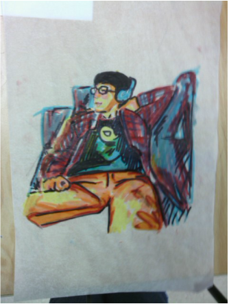
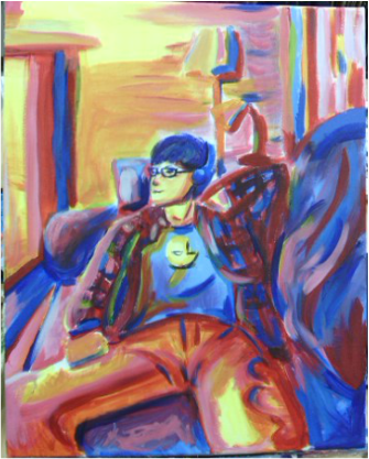
I started out with my base colors for my piece in where I believed the proportions started and ended and tried to blend colors enough to be interesting, but not enough to completely ruin the atmosphere. I began with a loose painting of the face just to get where the features are, but not finishing it completely.
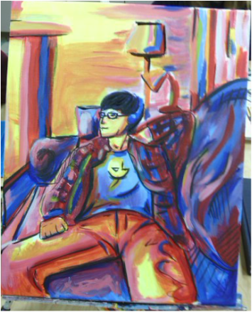
I wanted to give definite lines and details for this so I used black India ink to outline some of the darkest features. This made it pop out and help accentuate the colors more by contrasting with the palette I laid out.
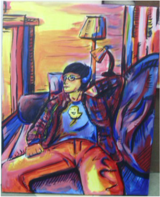
After I finished inking the piece where I wanted to add some more depth I began to fix the facial features and add more color to it. I really feel the slightly bent and curved likes in the picture give the room a less geometric feel and the palette I frequently use was placed perfectly. I tried something new with putting India Ink on top of the paint and I'm really happy with how it turned out. I was able to darken the picture without taking away the best aspects. I'm overjoyed with how this painting turned out and I feel like I've grown a lot as an artist, being able to put soo much feeling and care into a piece like this one.
 RSS Feed
