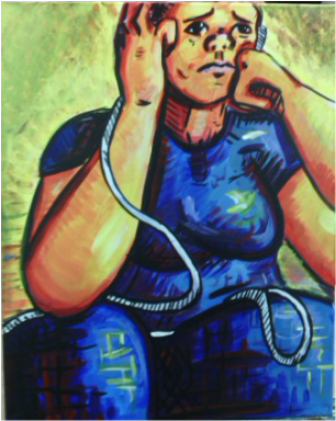
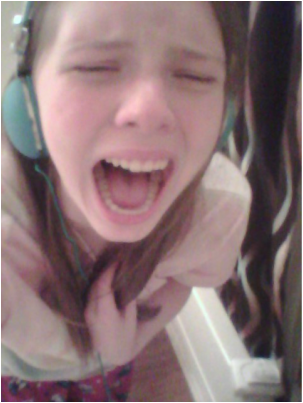
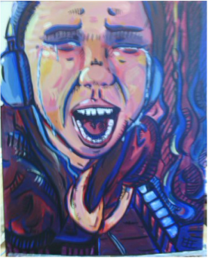
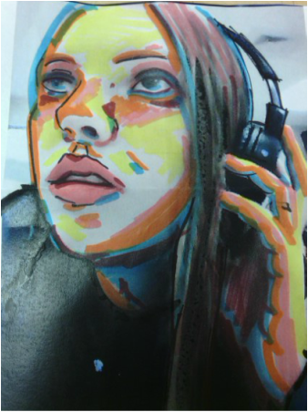
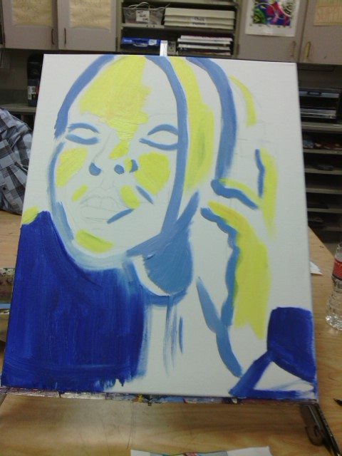
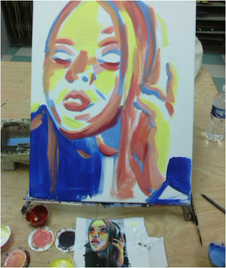
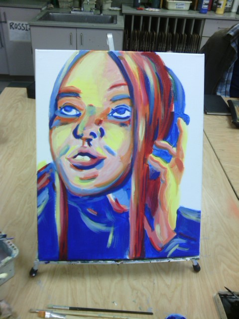
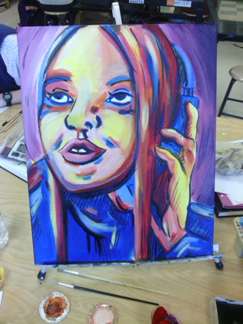
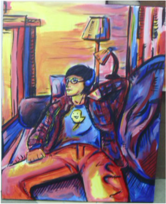
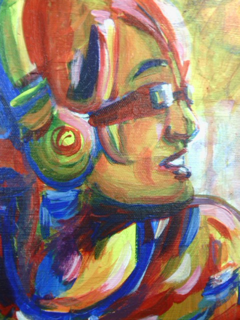
For this next project I decided to continue with pain but try a completely new angle. I laid on the floor and snapped pictures upward facing my friend Katie. I wanted to add some structure to my usual use lines and coloring so I made the outfit and body similar color pallets. I also painted geometric shapes on the pants to help unify the form of this piece. I really like the colors and texture of the painting because it gives you a typeof feeling you cant get looking at a normal photograph. I hope to continue improving on my painting skills and branching out into other types of mediums.
For this next piece I realized I hadn't done a piece based on sadness and agony and felt I needed to express such a powerful emotion in my style. I printed out multiple copies of the above picture and colored on them until I found a palette I really enjoyed. I felt like the colors needed to be deep and dark to portray the emotion well and the face needed to be colorful and full of sadness. I really like the colors in the tears and the dark blue strokes that emphasize her eyes and creases of her face. I wanted people to see this picture and remember a time they felt such a deep and raw emotion, because although it's sad and painful it's just as real as any other emotion out there. If I could redo this I'd probably spend more time on the face and touch it up (for the _7th_ time) making sure all the proportions were accurate because I feel like to convey the right emotion they need to be spot on. I'm extremely proud of this piece and going to be showing it at the Hale Art Show~
So it began with a simple lollygagged photo... Which I drew on with bright unrealistic colors, my favorite And converted to a painting. I placed the blue and yellow first wanting some defined shape to begin my piece. Then I added some more.... yep, color! I really wanted to get the depth correct with my colors because I loved this angle. Next I added in hair and gave it a rainbow hue with very wide palette. And finally I decided some ink and a background was in order. I really liked the purple because it made everything stand out. I'm proud of the color choices on this piece especially the hair, but If I could redo it I'd make the angle of the face exactly how I took it in the picture because that angle is much more interesting and I hadn't noticed I had gone off of it slightly :<
For this project I wanted a really unique and interesting composition in this piece to add more of a scenery and helps convey more of a mood with objects. I also wanted to be able to be able to insert more colors into the background to give it a less boring feel, while exposing myself to more structured lines and shapes, rather than my usual free flowing objects. I started out with my base colors for my piece in where I believed the proportions started and ended and tried to blend colors enough to be interesting, but not enough to completely ruin the atmosphere. I began with a loose painting of the face just to get where the features are, but not finishing it completely. I wanted to give definite lines and details for this so I used black India ink to outline some of the darkest features. This made it pop out and help accentuate the colors more by contrasting with the palette I laid out. After I finished inking the piece where I wanted to add some more depth I began to fix the facial features and add more color to it. I really feel the slightly bent and curved likes in the picture give the room a less geometric feel and the palette I frequently use was placed perfectly. I tried something new with putting India Ink on top of the paint and I'm really happy with how it turned out. I was able to darken the picture without taking away the best aspects. I'm overjoyed with how this painting turned out and I feel like I've grown a lot as an artist, being able to put soo much feeling and care into a piece like this one.
For this piece I took a photo of a classmate and redrew it in marker and pen, using a very different selection of colors and trying to add as much detail while keeping it colorful and spirited. I like to add colors that I feel reflect the mood of the picture fairly well because I feel colors are a great help in creating a certain feel. After my quick sketch was completed I decided to take it to the canvas, but I wanted to make sure every color was present and represented, so I began my work in layers. I like to use swift, hard, strategic lines when I paint instead of precise angles and shapes. It makes my art feel more relaxed and less structured than most. The layer below were the colors I found to be most prominent in the photo and the rest I believed were shading and highlights. This helped me create a base of color and help visual my final piece. At this point I added some dark blue to give more depth to my piece and creating more contrast to this painting. I like this color pallet a lot and find myself using more than I intend because of how well everything seems to fit together. For the highlights in this piece I used whiter brighter versions of the colors I used to darken it up so that they just looked brighter and not completely different. After I finished that I thought the background would need something less structured so I drew scribbles with very watered down paint and continued it throughout to give a more airy light feel while still giving it some color. I took great care in adding as much detail into the features as possible because the most emotion is displayed through the facial features and body language. I also wanted to accurately represent my friends as I saw them to help me better myself as an artist. Overall I think this project has been extremely successful. It shows the beginning of my breakout of regular constricted colors and helped me focus on my strategic line placement and color choices. I intend to continue feeling and representing emotion in my future pieces in just as interesting a way as this one.
|
AuthorWrite something about yourself. No need to be fancy, just an overview. Archives
May 2015
Categories |